What is Lexington Loaves?
Lexington Loaves started in Nathan & Courtney’s kitchen, a husband and wife team based in Lexington, SC. What began as a simple goal—to make better bread and baked goods for their own table-has grown into something they are excited to share with others.
What they had to work with.
LOGO

A logo with no brand identity or visual direction in place.
WEBSITE
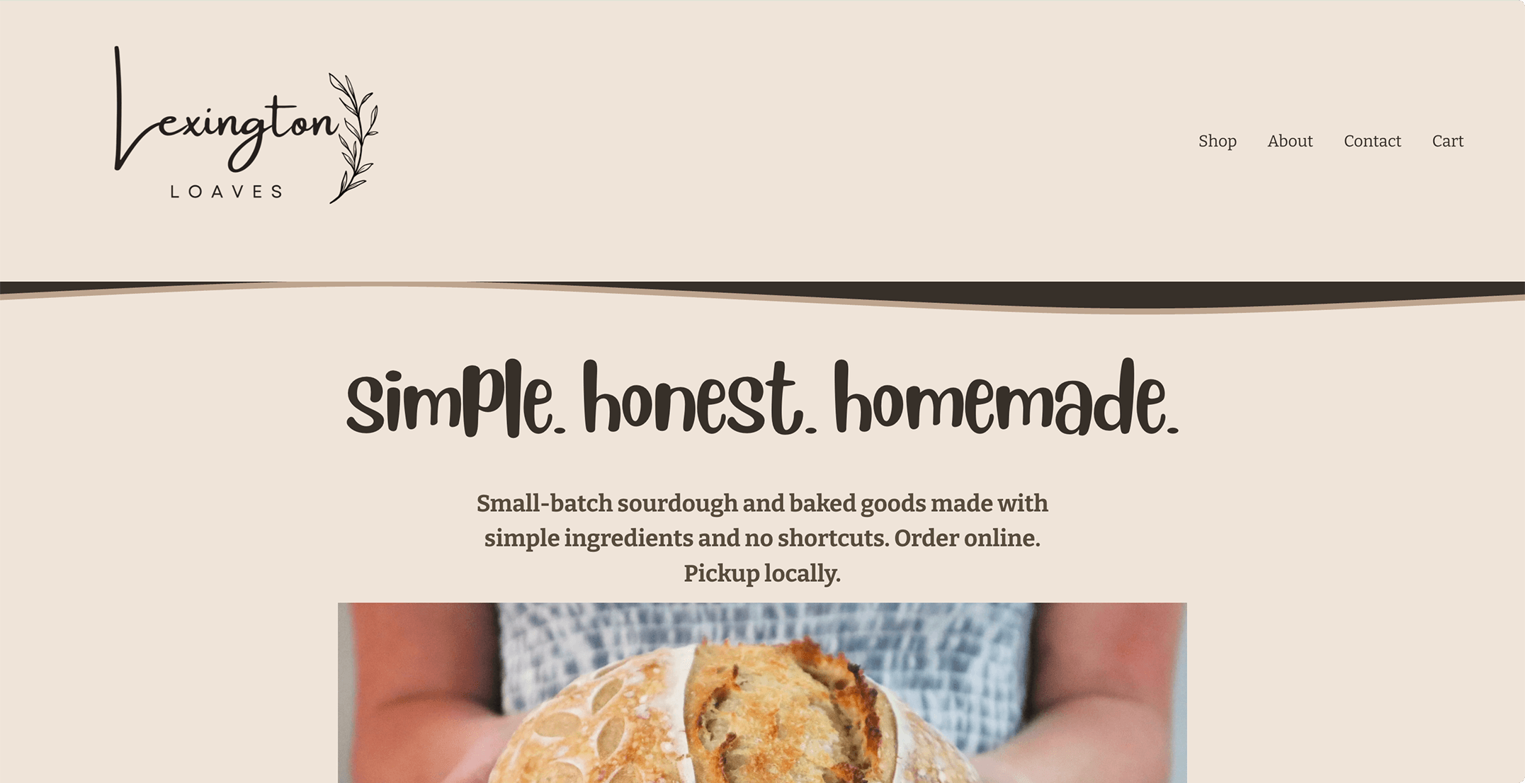
Lacking structure and refined visual design.

Inconsistent visuals, typography, and content.
Brand Identity & Direction

VOICE
We workshopped the direction for the voice of the brand allowing the visuals direction to be complimentary with the tone.
TAGLINE
MISSION
Research
TARGET AUDIENCE
It started off with a general target audience. This made it hard to visual who the exact target audience was. After a discussion about their mission and research about who fits their values, we were able to come to a defined target.
COMPETITORS
Conducted research for direct and indirect competitors, not only in the area, but across the country. After gathering all the information I analyzed the brand using the SWOT framework.
OPPORTUNITIES
Using SWOT helps organize what the opportunities for the brand are. With the goals they are trying to achieve, there is a gap in the market they can aim for – a clean neighborhood micro-bakery.
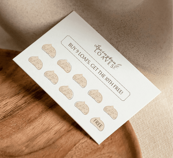
BRAND BOARD

HEADINGS
BELLEFAIR
SUBHEADING
JOST
PARAGRAPH
ROBOTO
Accent
MEDDON


MISSION
To make better everyday food easier through thoughtfully crafted baked goods made with ingredients you can recognize and trust.


#513523
PRIMARY
#CFB192
SECONDARY
#F7EEE5
TERTIARY
#B2B99F
ACCENT

Strategizing & Execute
An analysis of the original logo focused on two main points: hierarchy and illustration.
“Loaves” is so small and “Lexington” becomes the focal point where it should be the opposite. Seeing “Lexington” doesn’t tell me much about the brand, but seeing “loaves” definitely does.
The illustration is supposed to represent a wheat stem. However, this looks more like an olive branch.
Orginal logo reference:
PRIMARY LOGO
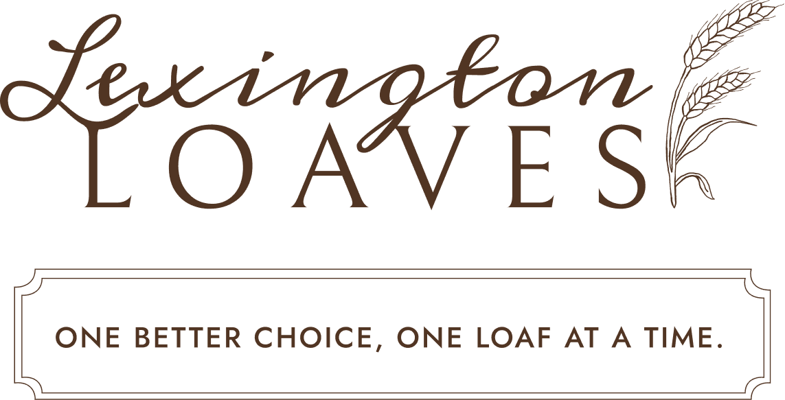


SUBMARK

COLOR PALETTE
They didn’t have a set color palette they were working from, however I noticed they were using a soft green, and light browns. Keeping to the original idea, we landed on these colors for Lexington Loaves.
BURNT
#513523

WHEAT BERRIES
#CFB192
THE STARTER
#F7EEE5

SOFT MINT
#B2B99F

TYPOGRAPHY
HEADLINES & DISPLAY
Bellefair
REGULAR
abcdefghijklmnopqrstuvwxyz
Bellefair is chosen for the headers as it is the same font used for the logo in “Loaves”. This helps keeps visual consistency throughout all platforms.
BODY & PARAGRAPHS
Roboto
LIGHT
Roboto is the font for all body copy. The simplicity and readable is important for large areas of text.
SUBHEADERS & LABELS
Jost
MEDIUM
Jost is another font not used in the logo, but compliments the fonts used. It’s simple, and bold, perfect for a subheader.
ACCENTS
Bellefair
Regular
Bellefair is chosen for the headers as it is the same font used for the logo in “Loaves”. This helps keeps visual consistency throughout all platforms.
PACKAGING
Arguably one of the most important parts for this business. Packaging can be easily overlooked and you can really bring your brand into these areas allowing it to feel intentional. Customers will be able to experience your brand not just visually but physically notice the effort in the small areas.
Wax Paper
Intentional
Carries brand look and feel


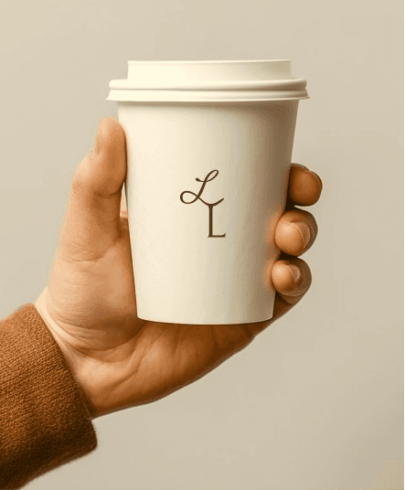


Shopping Bag
Buying multiple items
Simple branding for re-enforcement
DESIGN DIRECTION
Furthering the direction of the design should not just be packaging. There are social media posts, flyers, photographs, video direction and more. Having a direction you can follow helps keep your brand consistent across any platform.


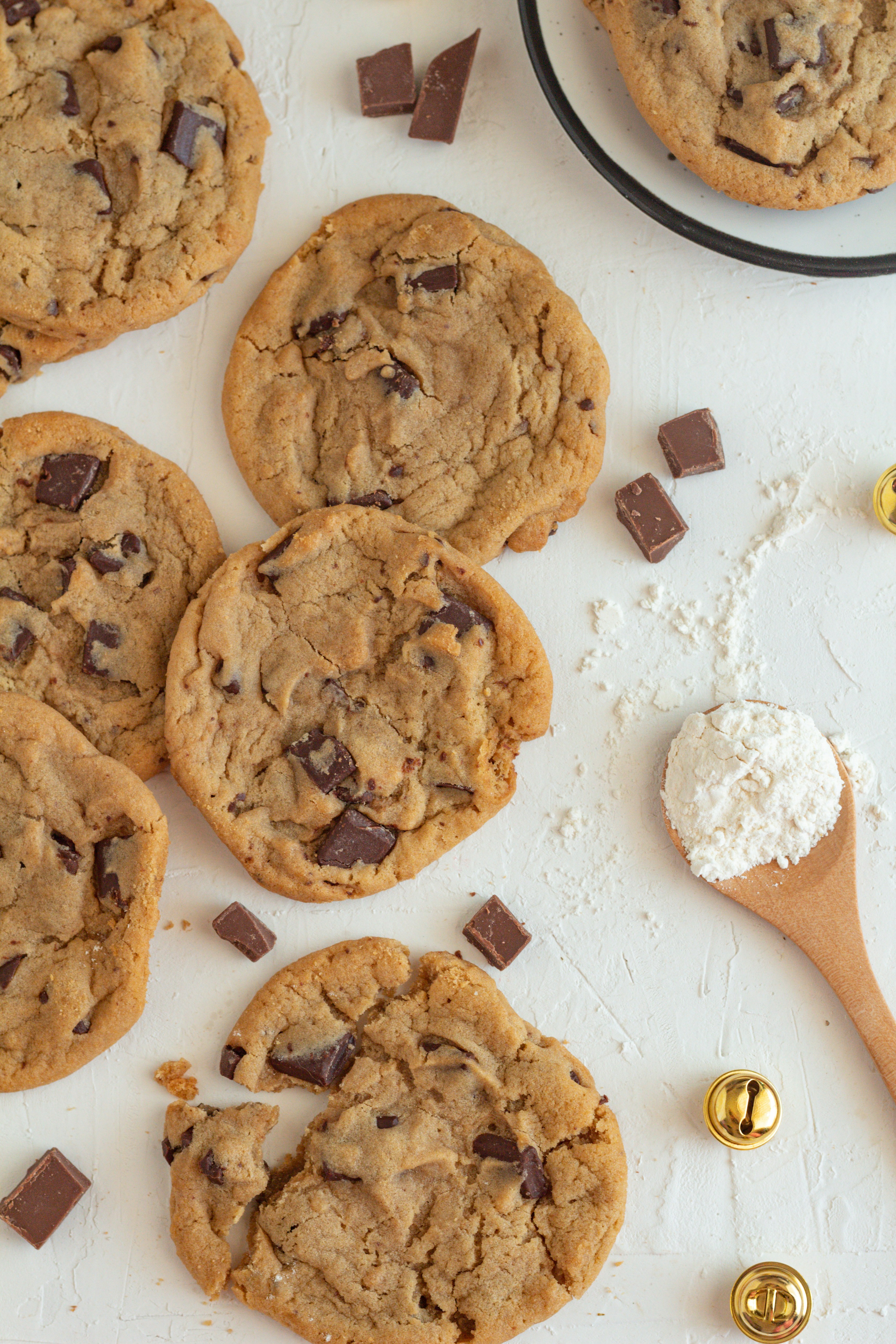


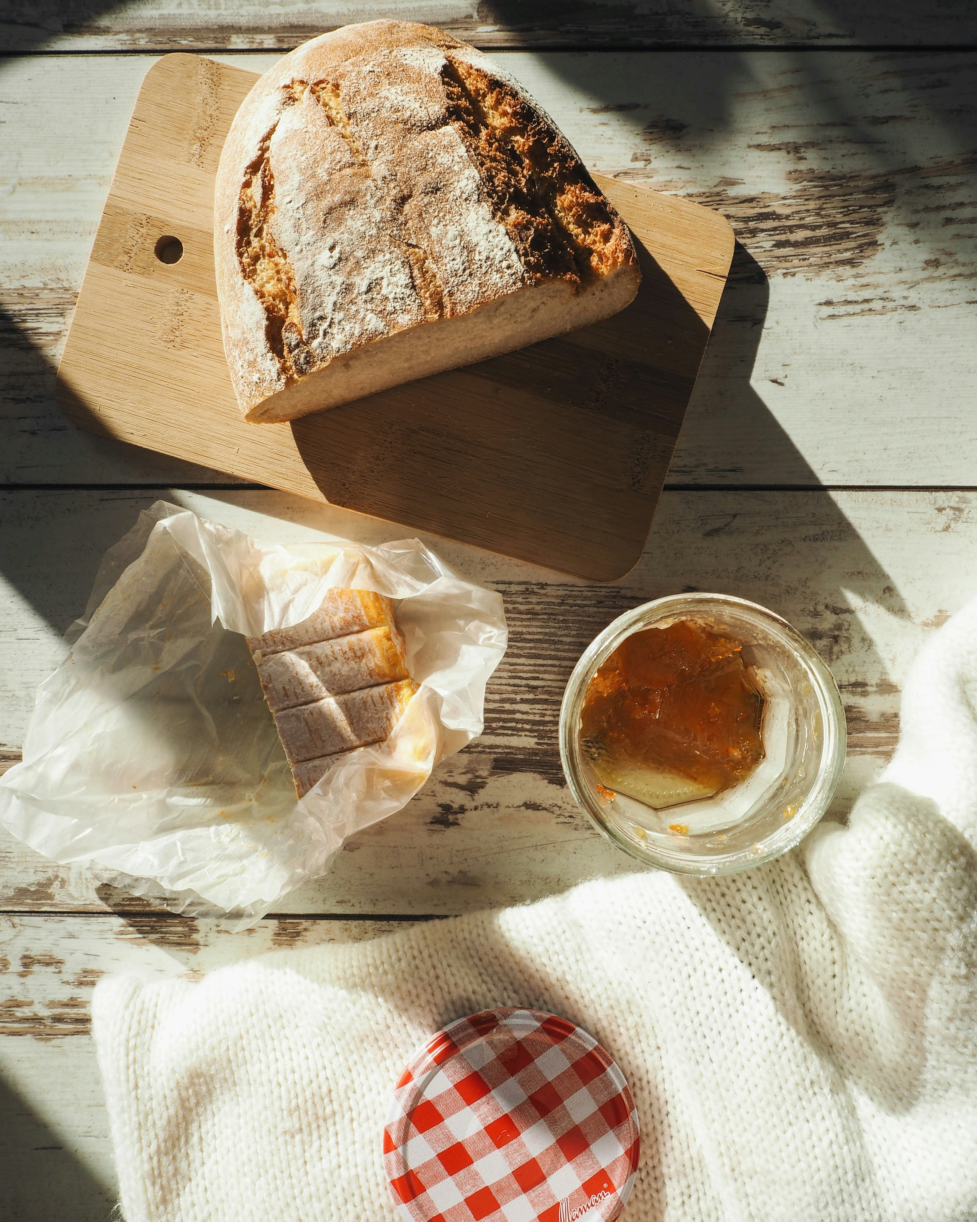
WARM TONES
GREEN ACCENTS
PACKAGING
BAKING PROCESS = STRAIGHT


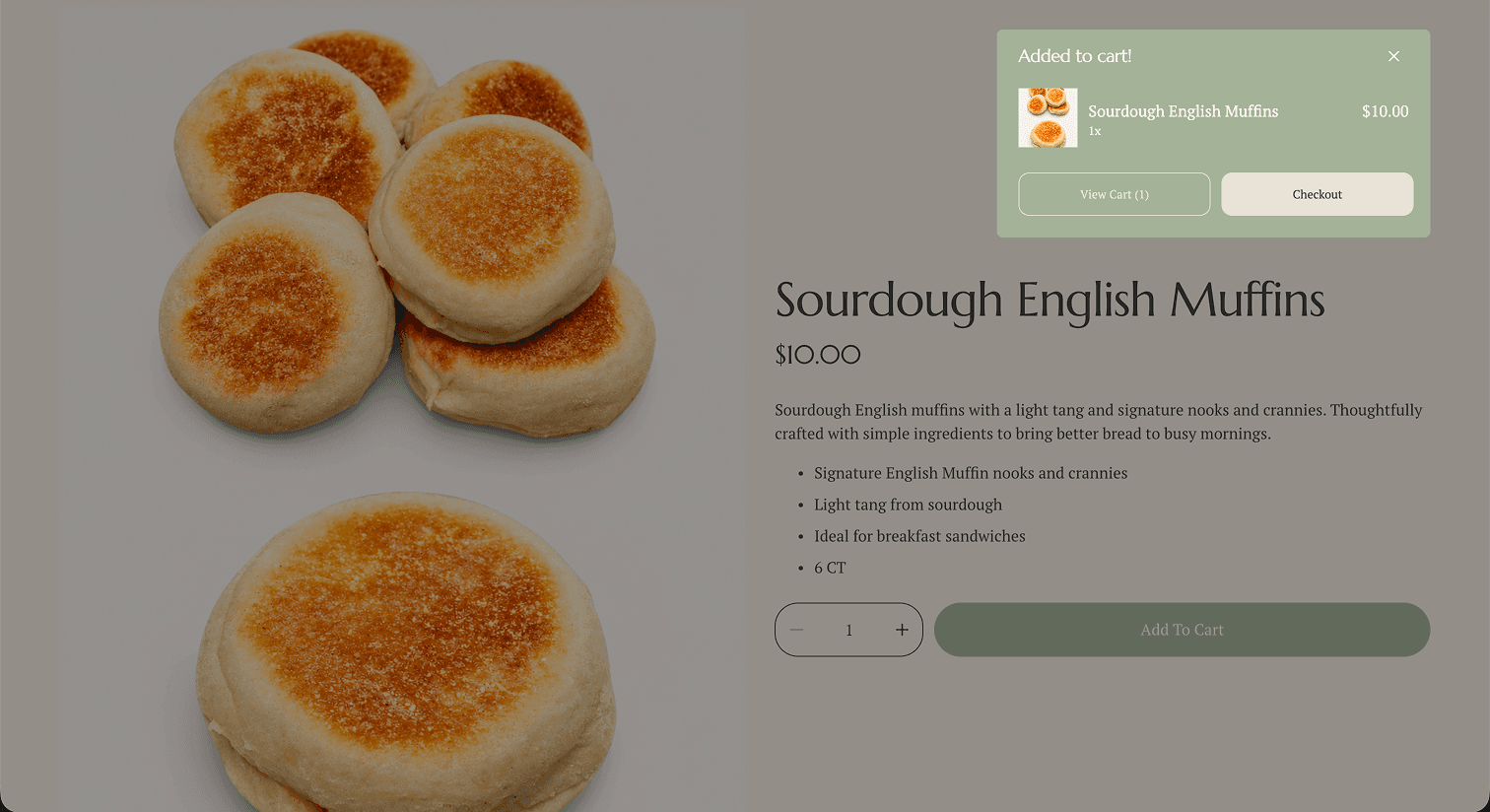
ORIGINAL SOCIALS & WEBSITE
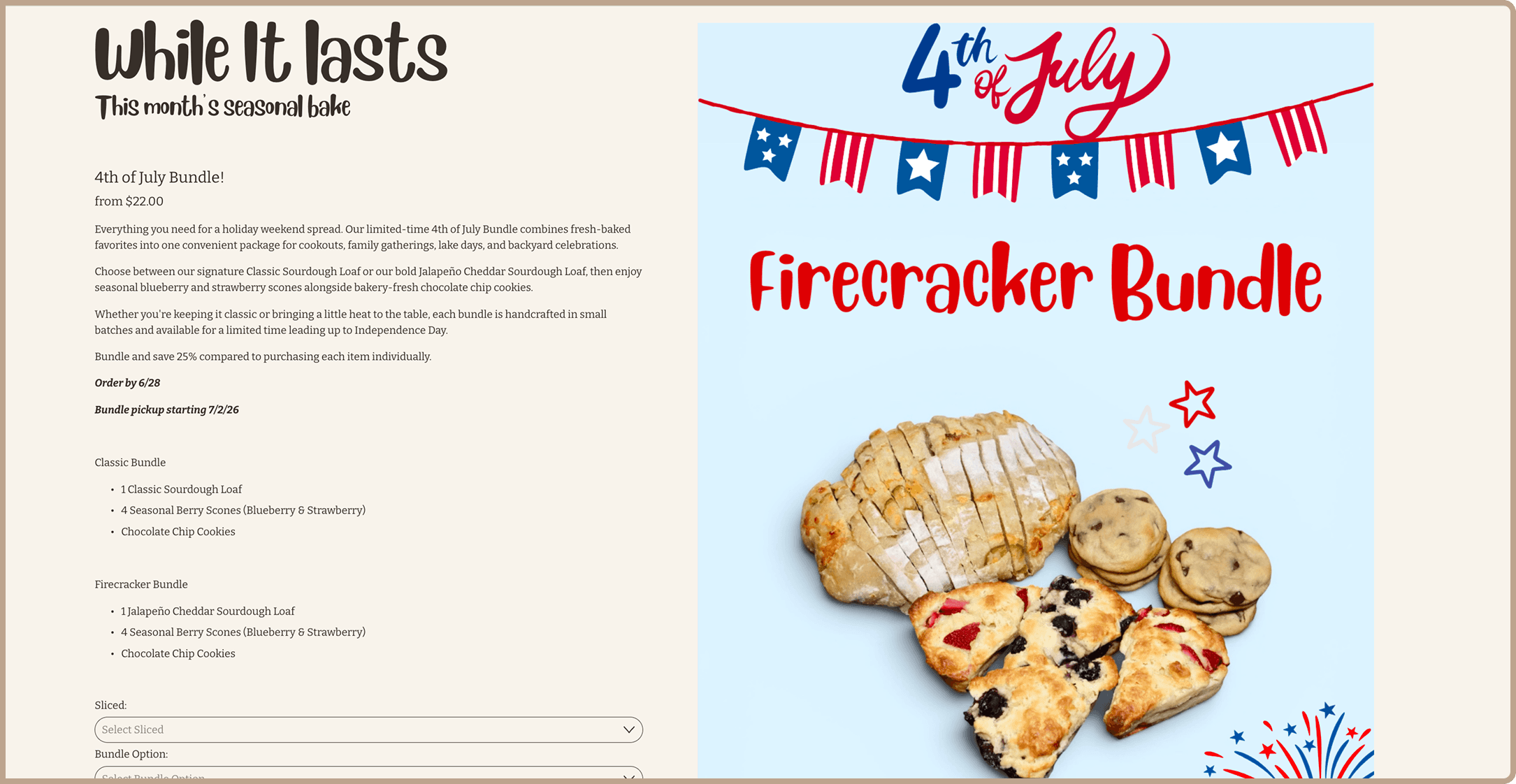




ONGOING REFINEMENT
Building Lexington Loaves is an active project, therefore, continuous refinement will occur as research and monthly analysis' take place.